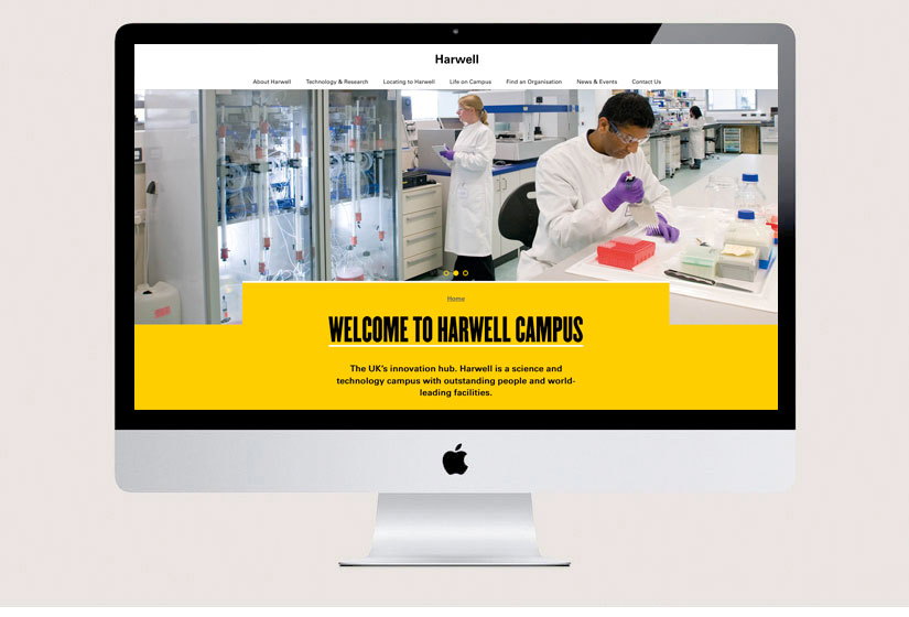
Harwell Campus
UI and UX
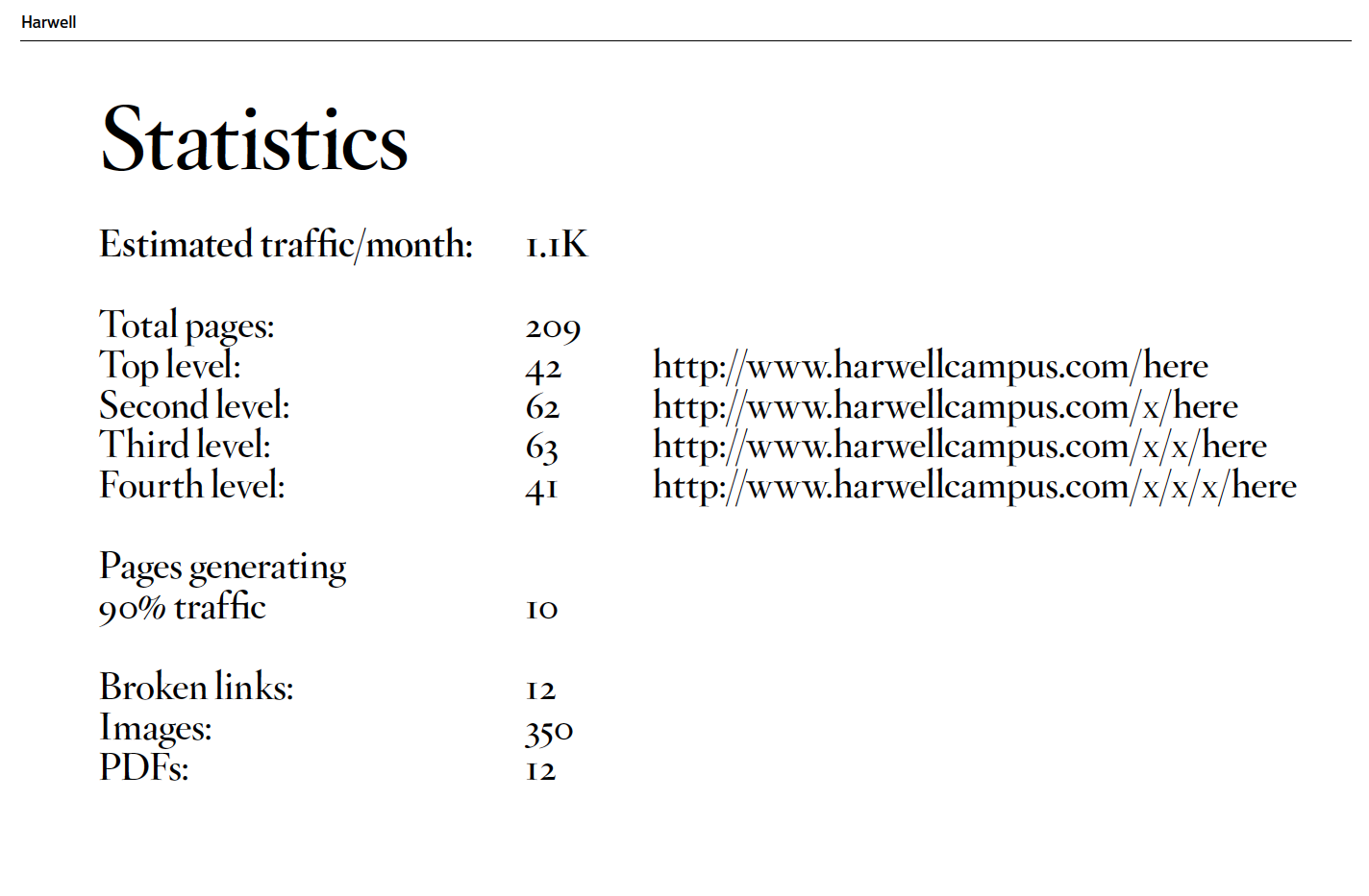
The Challenge
A good measure of a company homepage is whether a visitor can tell at-first-glance what the company does and what can be achieved on their website.
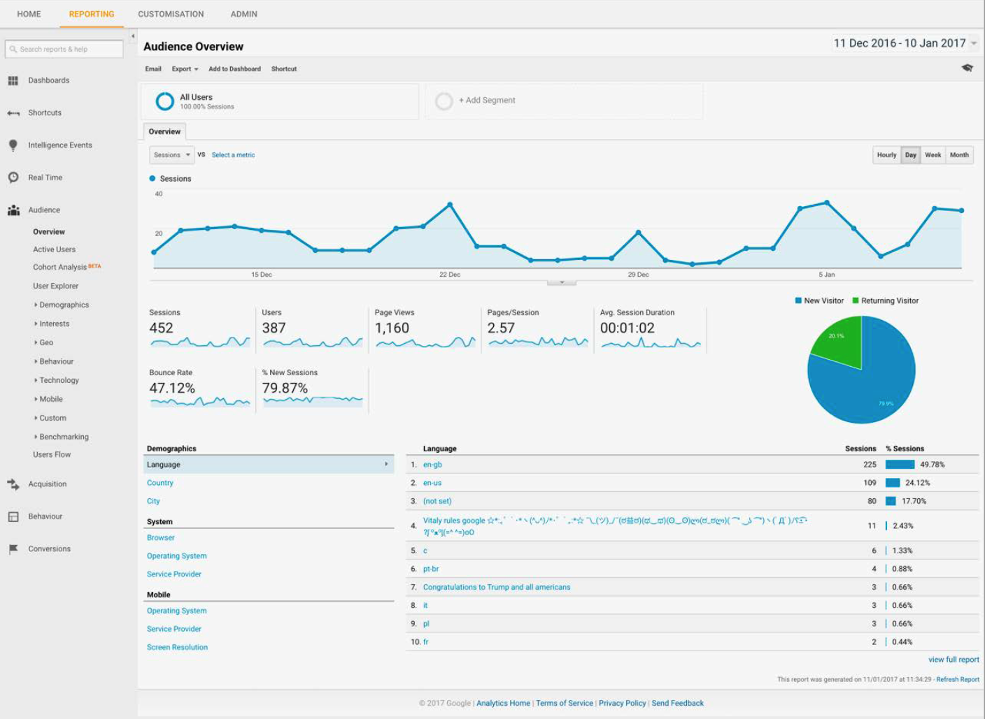
The original site singularly failed in this respect so our first objective was observation of the site and the users, audit these discoveries and discuss the website objectives, functionality and phase 1 priorities.

The Response
We began with a critical assessment of the original site.
Positive:
- The use of type on the site is generally good, with a clean, easy to read body font
- The copy is consistent (albeit a bit too technical in parts)
- There is lots of interesting information about the occupiers
- The site’s main navigation is well located, and easy to use
Negative:
- Photography could be more imaginative – although high resolution the overall effect is a little uninteresting
- The content needs to be more attention grabbing
- The site is very densely packed with the information and the hierarchy of information is convoluted, so the most important information is not always the most accessible
- The navigation should be very clear for each of the different user groups so they can find the relevant information quickly and easily
- Important information, headings, and links are lost in the current design.
- Assumes too much knowledge on the part of the visitor, try to limit use of acronyms and get the key
UX and UI
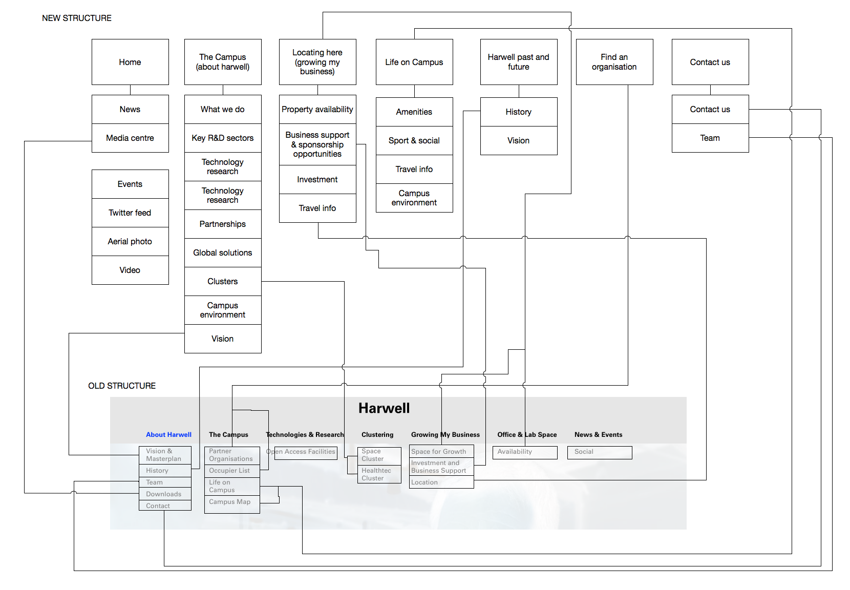
The client requested a full visual brand proposal to provide an evolution of the existing style while reinforcing their core ethos and difference to competitors – on the back of this design the UI was developed.
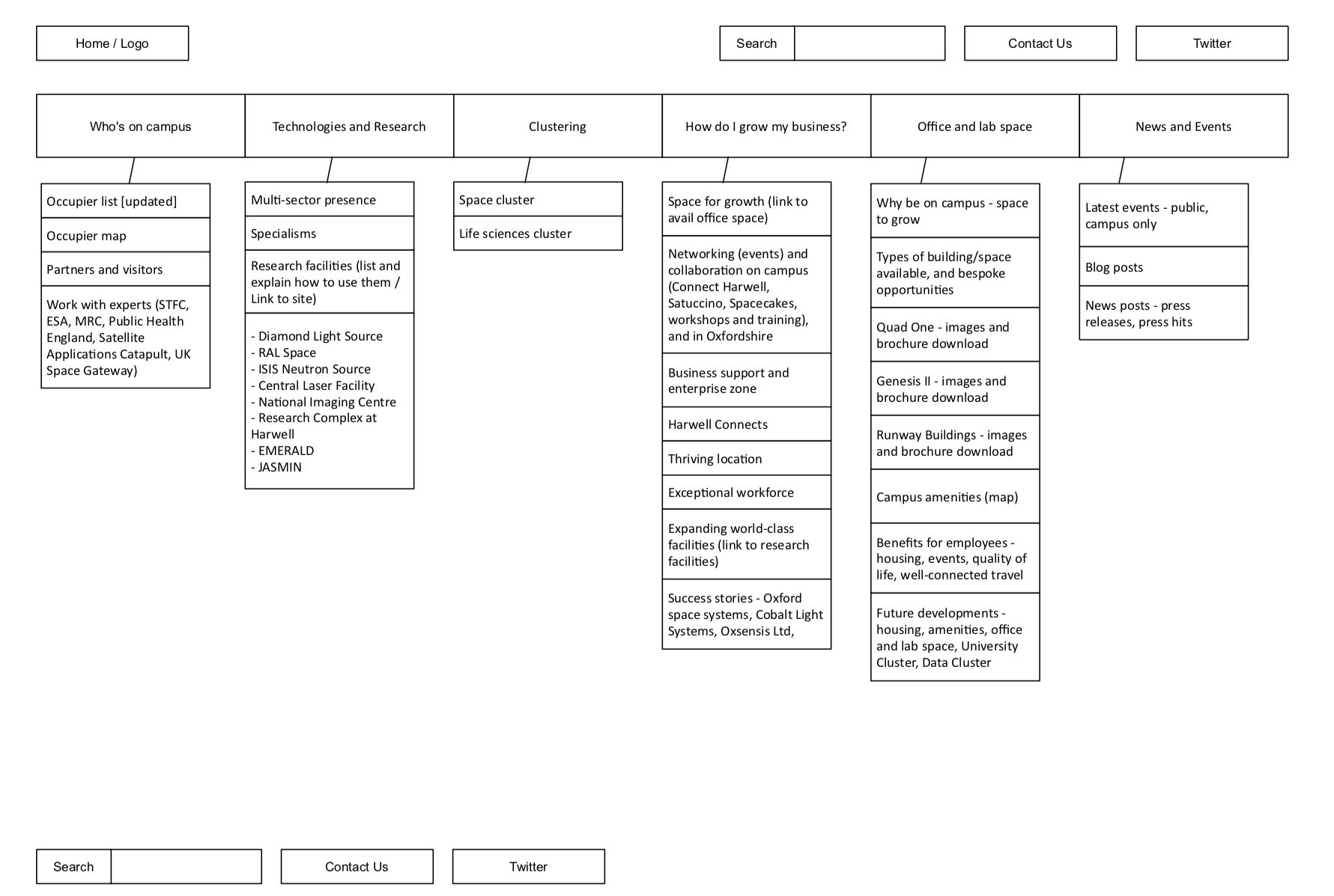
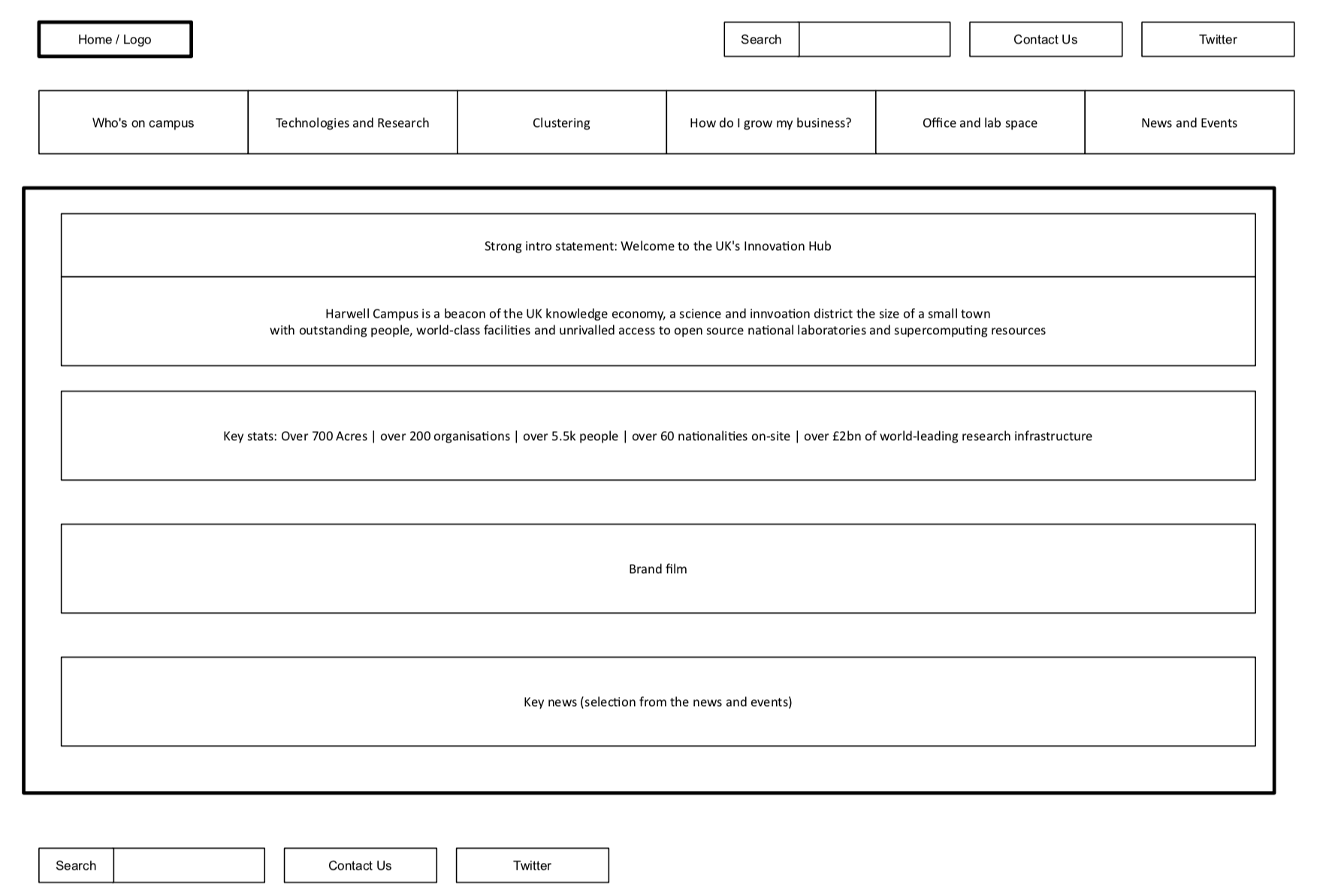
Wire-framing based on these discussions and research of core users was made and heavily tested and refined.
We created a fully responsive prototype in Marvel. Design questions were be answered quickly as well as helping to avoid working on static designs all the time.
Delivery
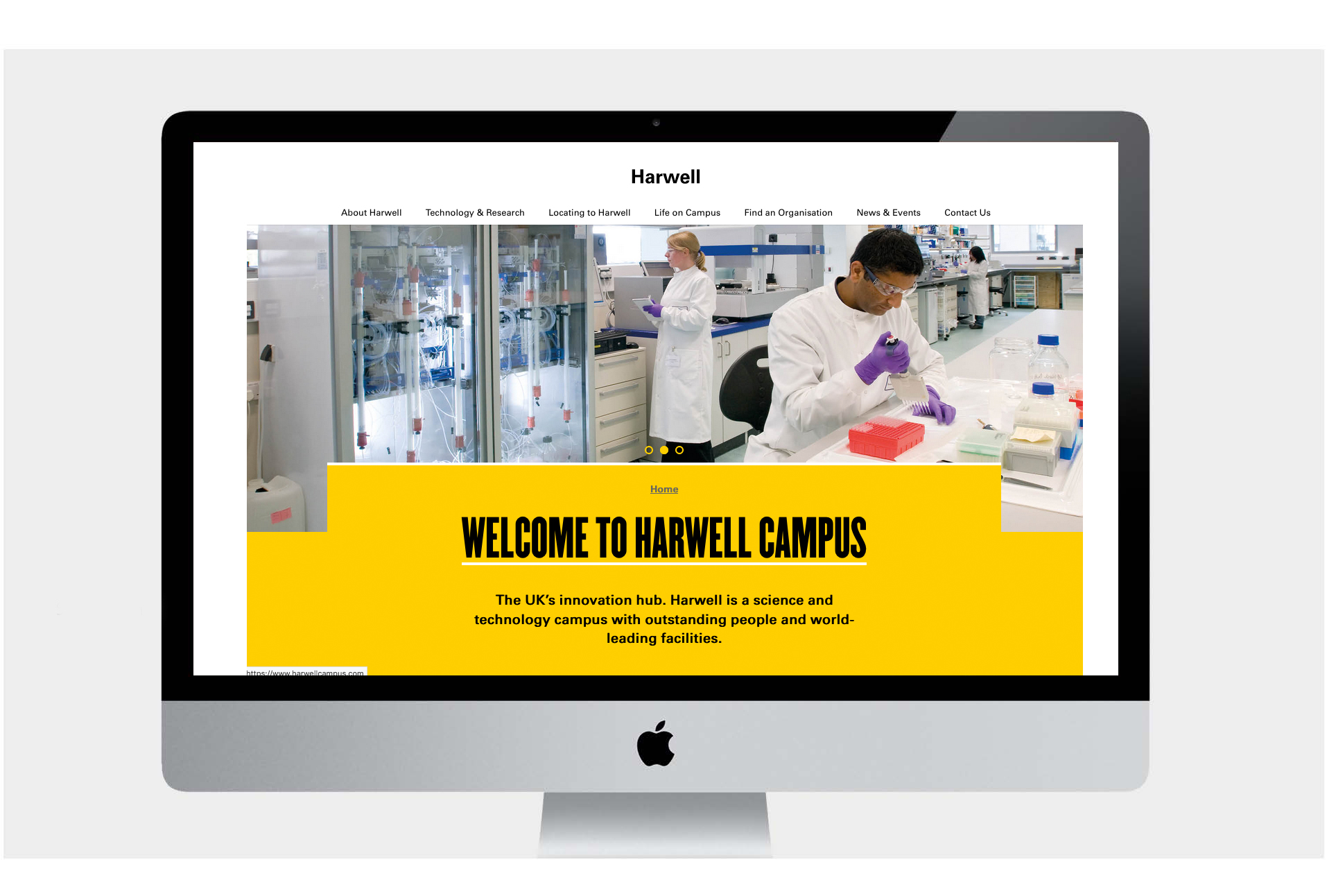
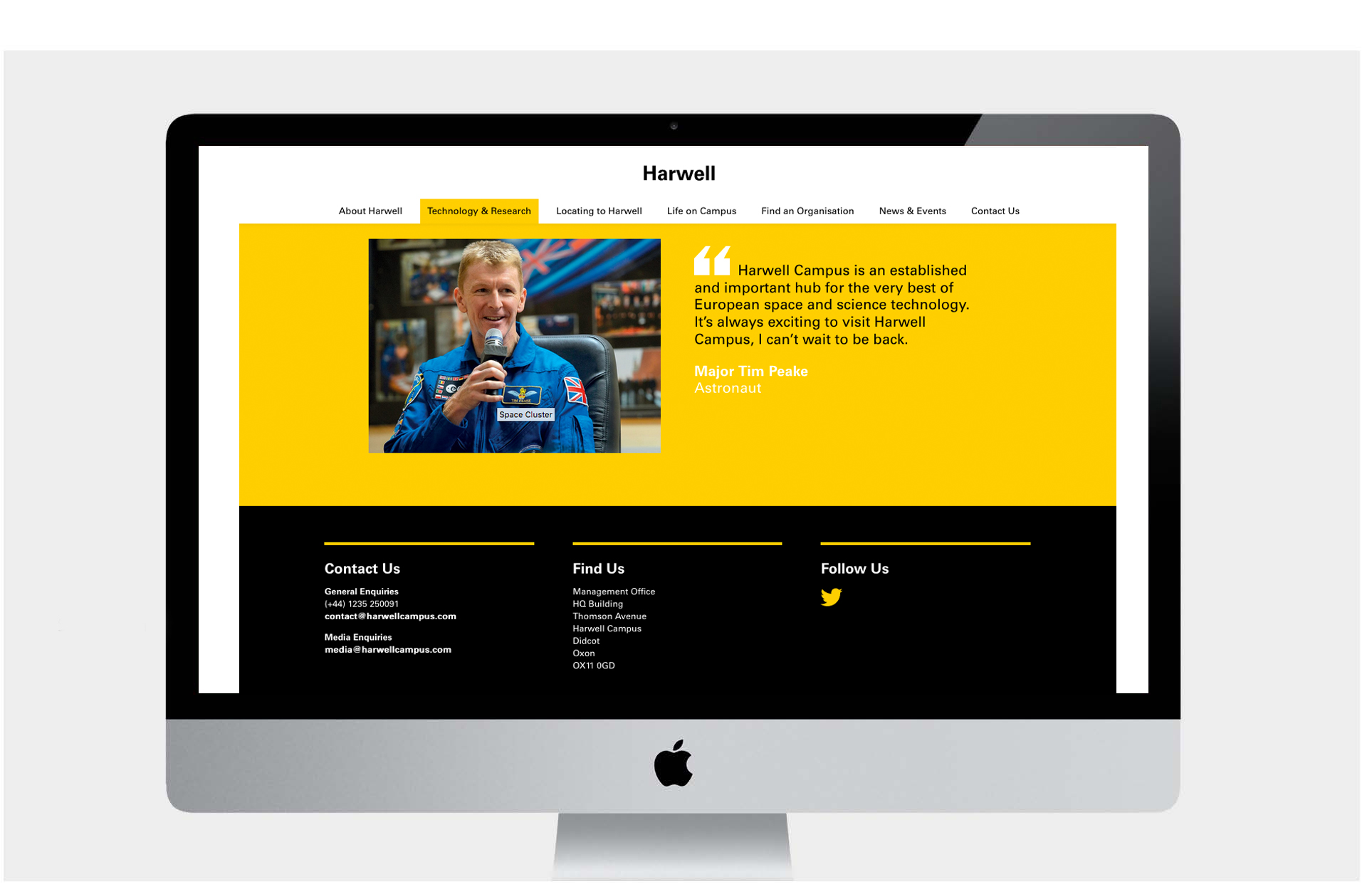
We now have a clear message on the homepage explaining the purpose and significance of Harwell. The quote is strong and emotive, and is supported with a clear statement of the mission.
The homepage can has been simplified by being more selective about which blog / news posts are shown on the homepage. Precedence has be given to the most relevant and interesting posts; these attract more traffic and keep users there when they land, which are both strong Google page ranking factors.
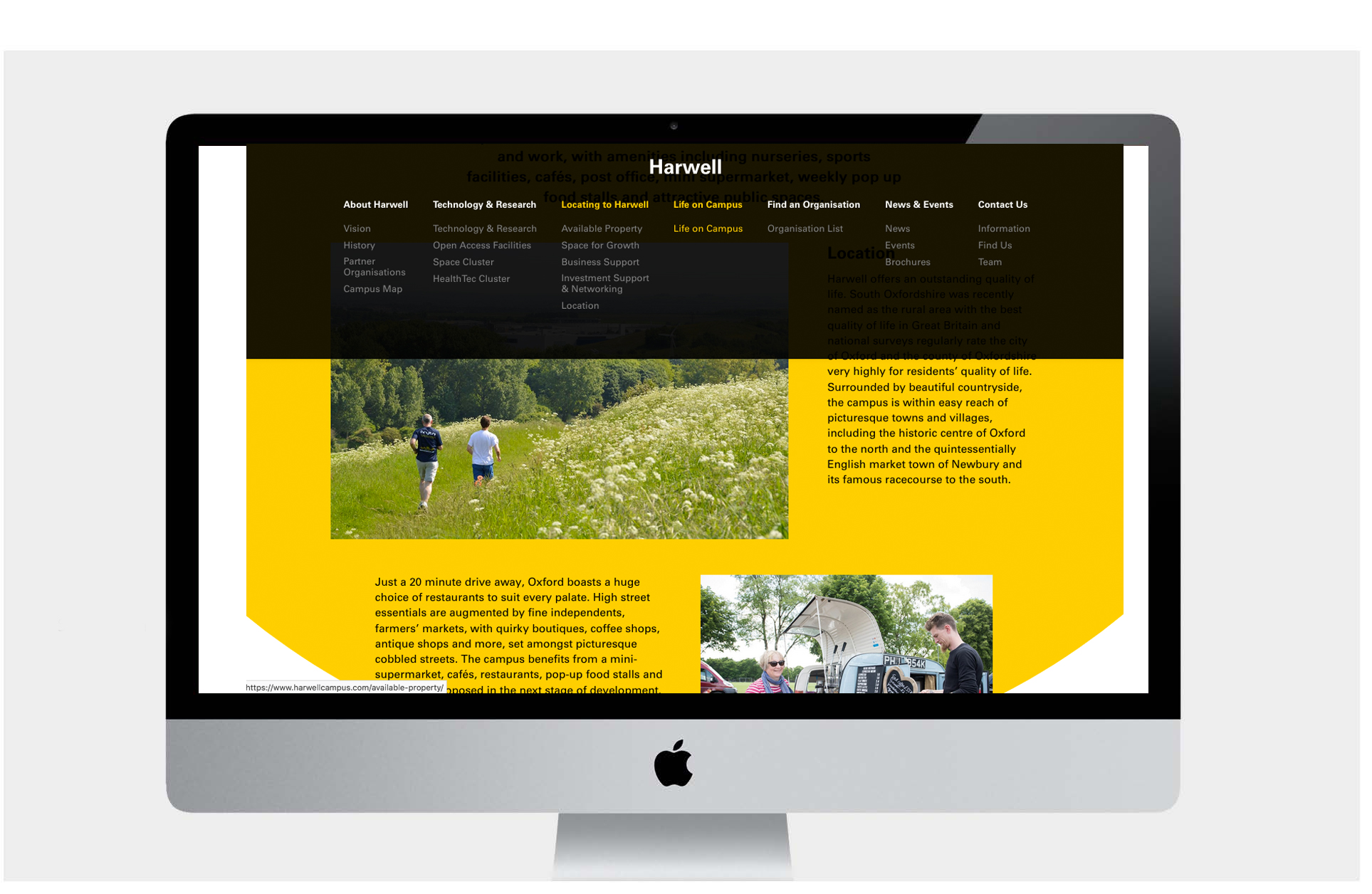
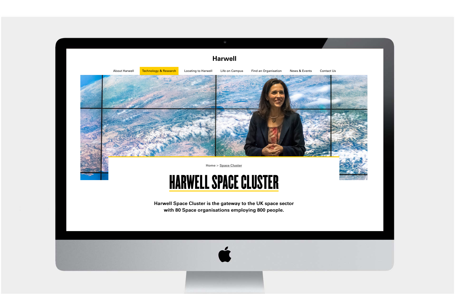
Subsequent pages now also clearly articulate at the start what the visitor will find on that page. This allows people to find the right information more easily. Important information, headings, and links were lost in the old design. E.g The ‘Research Facilities’ section can introduce the relationship between these facilities to the campus occupiers and visitors. Incorporating key information into the headline and copy makes navigation easier and is better for SEO.

Results

UX
UI Design
Web Development
Print - Art Direction
Team management
SEO Consultation
Case Studies
Sector: Commercial Property UX / UI
Sector: Banking
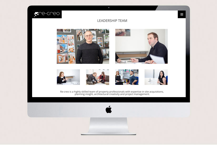
Sector: Real Estate
Sector: Architecture
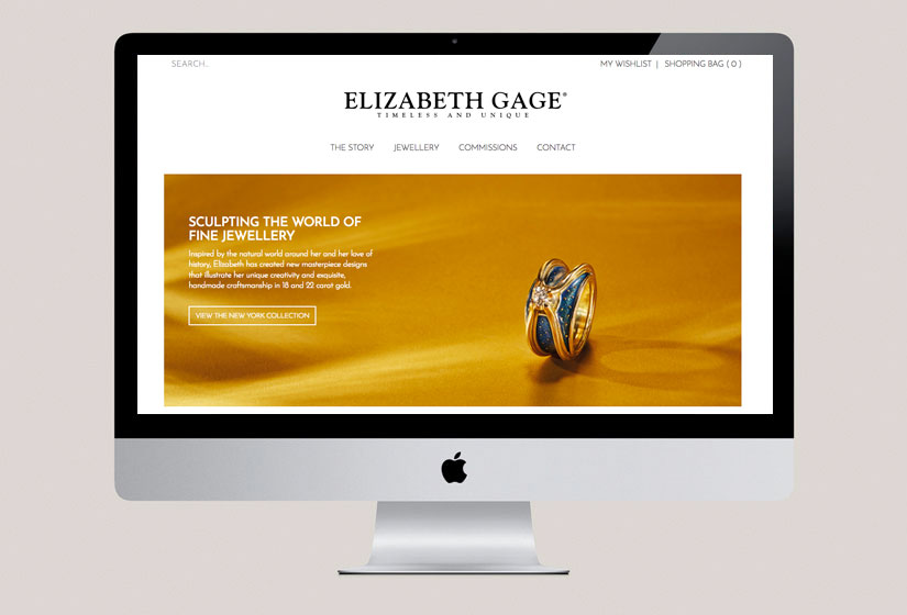
Sector: Fashion E-Commerce
Sector: Personal
Sector: Education
Let's Start Something new
Say Hello!
Fill in the form below, or try info@dan-simmons.co.uk or on 07971242054.
PS Do you know what an Easter Egg is ? !